
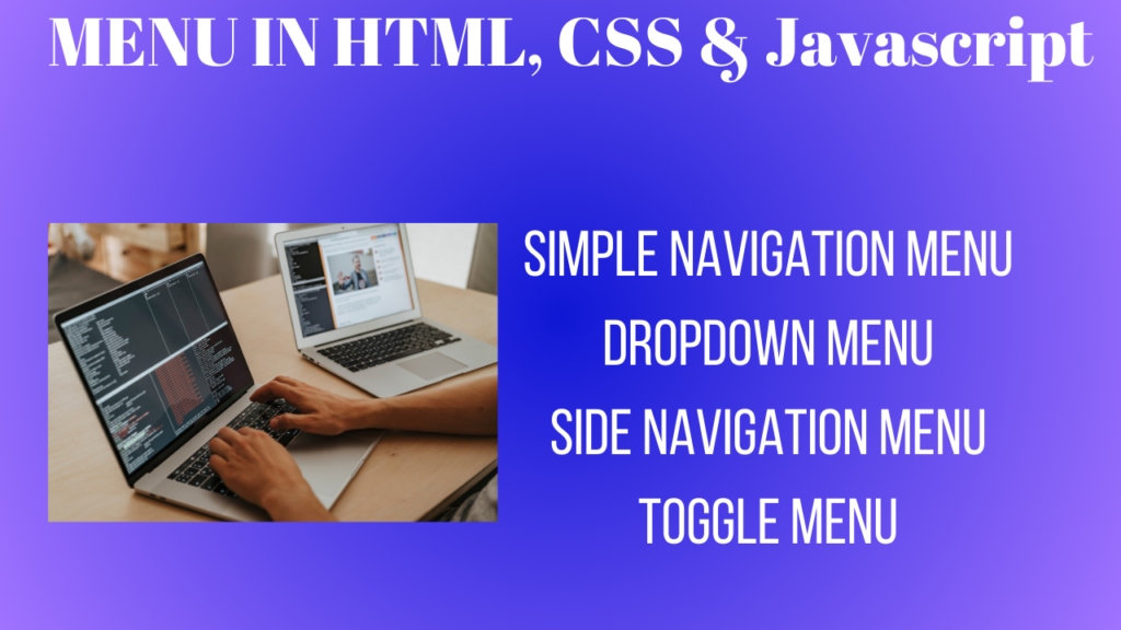
Different types of Menu using HTML, CSS and Javascript
Here, we are going to learn about different types of menu using html, css and javascript. The different types of menu are following as below.
1.Simple Navigation Menu
2.Dropdown Menu
3.Side Navigation Menu
4.Toggle Menu (Mobile friendly)
We have already seen different types of form using html, css and javascript.
1.Simple Navigation Menu
A fundamental user interface element that makes it easy for users to navigate between parts or pages of a website or application is a simple navigation menu. It usually comprises of a list of links placed either vertically or horizontally, offering simple navigation devoid of sophisticated elements like dropdown menus and animations. Basic CSS styling is frequently used to enhance the visual appeal and usefulness of simple navigation menus.
The fundamental structure consists of an unordered list(<ul>) with list items(<li>) that have anchor tags(<a>) attached to them.
Single rows or columns of items are arranged in a horizontal or vertical layout.
Minimal Style: Makes use of fundamental CSS properties like padding, hover effects, text alignment, background colors, and styles for layout and styling.
Static Links: Links do not have dynamic features like dropdown menus or collapsible sections; instead, they point to separate sections or pages.
See the Pen
Horizontal Menu by Meena Subash (@Meena-Subash-the-sasster)
on CodePen.
In this example, an unordered list is used to build the navigation menu, and each item in the list has a link. For a better user experience, a horizontal layout with a dark background and hover effects is created using basic CSS styles.
2.Dropdown Menu
One element of the user interface that lets users choose one option from a list of options is a dropdown menu. A list of options is shown to the user when they click or hover over a defined place, which is commonly a button or link. These alternatives are usually displayed in a vertical stack. Dropdown menus are frequently used to better organize options and save space in navigation bars, forms, and other interactive elements.
Trigger Element: A button or link that displays the menu when it is clicked or hovered over.
List of Options: A list of links or other objects that is hidden until the trigger element is triggered.
Vertical Stack: A vertical list is usually used to display options.
Visibility Toggle: In response to user input, the menu may appear or disappear.
CSS Styling: The menu and its items’ visibility, positioning, and styling are all controlled by CSS.
See the Pen
Dropdown Menu by Meena Subash (@Meena-Subash-the-sasster)
on CodePen.
In this example, an unordered list is used to construct the dropdown menu. A nested div for the dropdown content, which is initially hidden, is present in one of the list items. The menu’s appearance and visibility are controlled by CSS in response to user inputs such as hover events. To further improve the interface, JavaScript functionality can be implemented, such as the ability to toggle the menu on click.
3. Side Navigation Menu
A vertical list of links or buttons that is positioned on the side of a webpage or application is called a sidebar menu, or side navigation menu. Usually, this kind of menu is employed to offer a persistent navigation structure that enables users to quickly go to other areas or features without ever leaving the current page. When the screen width is sufficient, as it is with desktop programs, side navigation menus come in particularly handy for applications with intricate navigation requirements.
Vertical Layout: Usually on the left or right side of the screen, items are arranged vertically.
Persistent Visibility: When a user moves between sections of a website or application, the menu frequently stays visible.
Space-efficient: It saves horizontal space, which is perfect for applications with a lot of material.
Collapsible/Expandable: To conserve space, certain side menus allow you to collapse or expand specific areas.
The menu can be styled and positioned using CSS, either fixed or relative to the main content area.
See the Pen
Side Menu by Meena Subash (@Meena-Subash-the-sasster)
on CodePen.
In this example, a div with the class sidenav is used to build the side navigation menu, and each menu item has an anchor tag inside of it. The menu is styled by CSS to be fixed on the left side of the screen and to occupy the entire viewport height. To accommodate the side navigation menu, the main content area has been shifted to the right.
4.Toggle Menu
A toggle menu is a type of user interface element that enables users to click or press an icon or button to reveal or conceal a menu. Because screen real estate is restricted in mobile and responsive site design, this kind of menu is especially helpful. Toggle menus, which conceal navigation options until needed, contribute to a clear and simple interface.
Trigger Element: An icon or button (often a hamburger icon ☰) that, when pressed or clicked, changes the menu’s visibility.
By Default, the menu is hidden and is only shown upon activation of the trigger element.
Responsive design is perfect for mobile devices because it can adjust to different screen sizes.
CSS and JavaScript: JavaScript is used to toggle the visibility of the menu, while CSS is used for styling.
Simple animations are frequently used to smoothly reveal or conceal the menu.
See the Pen
Toggle Menu by Meena Subash (@Meena-Subash-the-sasster)
on CodePen.
The toggle menu in this example is made with a button that has the class menu-toggle, which when clicked, toggles the menu list’s visibility. The menu is styled and made to fit various screen widths thanks to CSS. The menu’s show/hide functionality is managed by the JavaScript method toggleMenu().
These examples offer different types of menu designs using HTML, CSS and Javascript, ranging from straightforward horizontal bars to more interactive toggle and dropdown menus that work well on mobile devices. To meet your unique design specifications, make the necessary adjustments to the styles and scripts.
Hi everyone, it’s my first pay a quick visit at this site,
and article is genuinely fruitful for me, keep up posting these posts.
Spot on with this write-up, I absolutely think this amazing site needs a lot more attention. I’ll probably be returning to see more, thanks for the information!